Flow & Tell with iShares | May 2023

GROUNDHOG MAY: INVESTORS CONTINUE TO FAVOR HIGH-QUALITY EXPOSURES ACROSS EQUITY & BOND ALLOCATIONS

May’s market moves were largely emblematic of YTD trends: tech juggernauts continued to dwarf other industries, leading broad market gains, offset by drags from eight of the other S&P 500 sectors. This tech optimism was reflected in flows, and the sector notched its highest week of inflows in 17 months.1

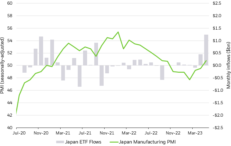
Elsewhere, weak economic data at home sent investors shopping abroad — Japan ETFs netted inflows as the Nikkei 225, the Tokyo Stock Exchange’s analog, hit 33-year highs.2 Fixed income investors continued to lean into broad, investment-grade exposures.

THEMES OF THE MONTH

Back to basics

Investors up duration in aggregate fixed income allocations.

Techtonic shifts

Megacap tech’s rally extended as investors allocate to sector heavyweights.

Cherry blossom dreams

Japan ETFs notched their highest month of inflows since 2020 on the heels of rebounding economic activity.

MAY ETF FLOWS

May ETF heat map

May ETF flows compared with index performance

Scatter plot showing the relationship between index performance and ETF sub-asset class flows for May 2023.

Source: BlackRock, Bloomberg, chart by iShares Investment Strategy. As of May 30, 2023. Flows normalized by AUM as of January 31, 2023.


Index performance is for illustrative purposes only. Index performance does not reflect any management fees, transaction costs or expenses. Indexes are unmanaged and one cannot invest directly in an index. Past performance does not guarantee future results.


Index performance is measured by the following indexes: EM  Equity: MSCI Emerging Markets IMI Index; Gold: ICE LBMA Gold Price Index; U.S. Treasury: ICE BofA 10-Year U.S. Treasury Index; Communication Services: S&P 500 GICS Level 1 Communication Services Sector Index; Utilities: S&P 500 GICS Level 1 Utilities Sector Index; HY Credit: iBoxx USD High Yield Index; Commodities: S&P GSCI Index; Information Technology: S&P 500 GICS Level 1 Information Technology Sector Index; Consumer Staples: S&P 500 GICS Level 1 Consumer Staples Sector Index; health Care: S&P 500 GICS Level 1 Health Care Sector Index; Financials: S&P 500 GICS Level 1 Financials Sector Index; Industrials: S&P 500 GICS Level 1 Industrials Sectors Index; Energy: S&P 500 GICS Level 1 Energy Sectors Index. Coloring is based on quadrants: quadrant I: green; quadrant II: yellow; quadrant III: pink; quadrant IV: purple.

Chart description: Scatter plot showing the relationship between index performance and ETF sub-asset class flows for May 2023. Chart shows some sectors, like Industrials and Commodities, see both negative index performance and outflows in May. On other hand, US Equities and Communication Services sectors saw both positive ETF flows and index performance.


BACK TO BASICS

The Bloomberg Aggregate Bond Index is about as basic as it gets when it comes to the US investment grade bond market, offering exposure to a large swathe of both government and corporate bonds. But while it may not often be the sexiest tactical allocation, it certainly was one of the most popular in May. US aggregate bond ETFs saw net inflows of $7.7bn over the month.3 May marked the exposure’s fourth consecutive month of inflows, in line with recent historical trends — the exposure has only registered 3 months of outflows in the last 3 years.

While flows flocked to the front of the curve in Q1 amid elevated yields, many investors began adding longer-dated exposures in a “flight to quality” trade in March, following severe bond market volatility — a duration preference that remained in May. We maintain our up in quality preference, also reflected in the Bloomberg Aggregate Bond Index composition, with roughly 70% of holdings notching a AAA-rating, while only 12% of the index sits in the lowest portion of the investment-grade bond market (BBB).4

US aggregate bond ETFs remain favored exposures

Bar chart depicting monthly ETF flows into US Agg ETF from January 2020 to May 2023.

Source: BlackRock, Bloomberg, Markit, chart by iShares Investment Strategy. ETF groupings determined by Markit. As of 05/30/2023.

Chart description: Bar chart depicting monthly ETF flows into US Agg ETF from January 2020 to May 2023. The chart shows positive inflows over the past four months, as investors allocate along the curve in high-quality fixed income exposures.


TECHTONIC SHIFTS

The macroeconomic backdrop of 2022 was marred by soaring interest rates, creating a turbulent atmosphere that delivered the year’s “tech wreck” — sector juggernauts saw huge losses as Meta dropped two-thirds of its value, Amazon’s market cap halved, and the tech-heavy Nasdaq clocked its third-worst year on record (behind only 2008 and the dotcom bust of 2000).5

That story has played out in reverse this year: tech’s shares of major indexes have soared as the sector continues to sharply outperform the broader market. Part of the tech frenzy can be traced to a flight to relative safety in companies with strong balance sheets, demonstrated by trading in March, when the five largest US tech companies each climbed over 10% despite two regional bank failures jolting global markets.6 Fervor over artificial intelligence reflects part of the price action as well, strengthened by the earnings success in behemoths like chip maker Nvidia.

Flows follow suit: the tech sector saw its largest week of inflows last week since December 2021.7 Globally, tech focused ETFs popped from $1bn worth of YTD inflows at the end of April to more than $7bn today in broad based buying.8

Tech sector leads market gains

 Bubble chart showing the eleven S&P 500 sectors charted with YTD performance on the X-axis, and 1-month performance on the Y-axis, with marker size relative to the sector’s market cap.

BlackRock, Bloomberg, chart by iShares Investment . As of 05/26/2023.


Index performance is for illustrative purposes only. Index performance does not reflect any management fees, transaction costs or expenses. Indexes are unmanaged and one cannot invest directly in an index. Past performance does not guarantee future results.


Tech as represented by the S&P 500 Info Tech Index, Consumer Discretionary as represented by the S&P 500 Consumer Discretionary Index, Real Estate as represented by the S&P 500 Real Estate Index, Financials as represented by the S&P 500 Financials Index, Comms Services as represented b the S&P 500 Comms Services Index, Industrials as represented by the S&P 500 Industrials Index, Utilities as represented by the S&P 500 Utilities Index, Materials as represented by the S&P 500 Materials Index, Healthcare as represented by the S&P 500 Health Care Index, Energy as represented by the S&P 500 Energy Index, Cons. Staples as represented by the S&P 500 Consumer Staples Index.

Chart Description: Bubble chart showing the eleven S&P 500 sectors charted with YTD performance on the X-axis, and 1-month performance on the Y-axis, with marker size relative to the sector’s market cap. The chart shows the tech sector performs highest, both YTD and MTD, while energy is the largest laggard.


CHERRY BLOSSOM DREAMS

Economic activity in Japan has rebounded in 2023, with GDP growing at an annualized rate of 1.6% in Q1.9 Strong domestic demand, a rebound in tourist spending from the reopening in China, and resilient manufacturing activity underpins the growth. There is reason for the optimism to persist with Q2 economic data also pointing to robust activity.

Personal consumption, which makes up the largest portion of GDP, increased by 0.6% quarter-over-quarter in the first quarter, led by tourist-adjacent services like lodging and transportation.10 In May, Japan services PMI rose to a record 56.3, expanding at the largest rate on record, boosted by robust tourism activity and domestic spending.11 May also saw manufacturing activity touch expansionary territory for the first time since October 2022.

The robust economic activity, coupled with the potential end of ‘yield curve control,’ helped propel the MSCI Japan Index to its highest level in over 35 years. Investors have taken notice, adding $1.2bn to Japan ETFs in May — the highest single month of inflows since 2020.12

Flows reach 3-year highs on rebounding economic data

Bar chart depicting monthly ETF flows into Japan ETFs, alongside a line chart depicting Japan’s manufacturing PMI.

Source: BlackRock, Bloomberg, Markit, chart by iShares Investment Strategy. ETF groupings determined by Markit. As of 05/30/2023. Japan Manufacturing PMI in reference to Japan Manufacturing PMI Index.

Chart description: Bar chart depicting monthly ETF flows into Japan ETFs, alongside a line chart depicting Japan’s manufacturing PMI. The chart shows an increase in PMI levels in the past quarter, and flows have turned positive following the trend.


FEATURED FUNDS

FEATURED FUNDS

FEATURED FUNDS

Kristy Akullian, CFA

Kristy Akullian, CFA

Senior member of the iShares Investment Strategy team

Jon Angel

Investment Strategy

Contributor

Faye Witherall

Investment Strategy

Contributor

Nick Morales

Investment Strategy

Contributor

Robert Young

Markets Coverage

Contributor